Typography plays a critical role in any design; in fact, it accounts for as much as 95% of everything we see on the Web. When done well, it adds personality to content, becomes its voice. When established poorly, typographic elements become unreadable, thus reducing the impact a given piece of content will have on the reader.
In some cases, it will lead to problems with processing text, and thus increasing cognitive load on the user. The bigger the congnitive load is, the harder it is for users to complete their tasks.
Typefaces
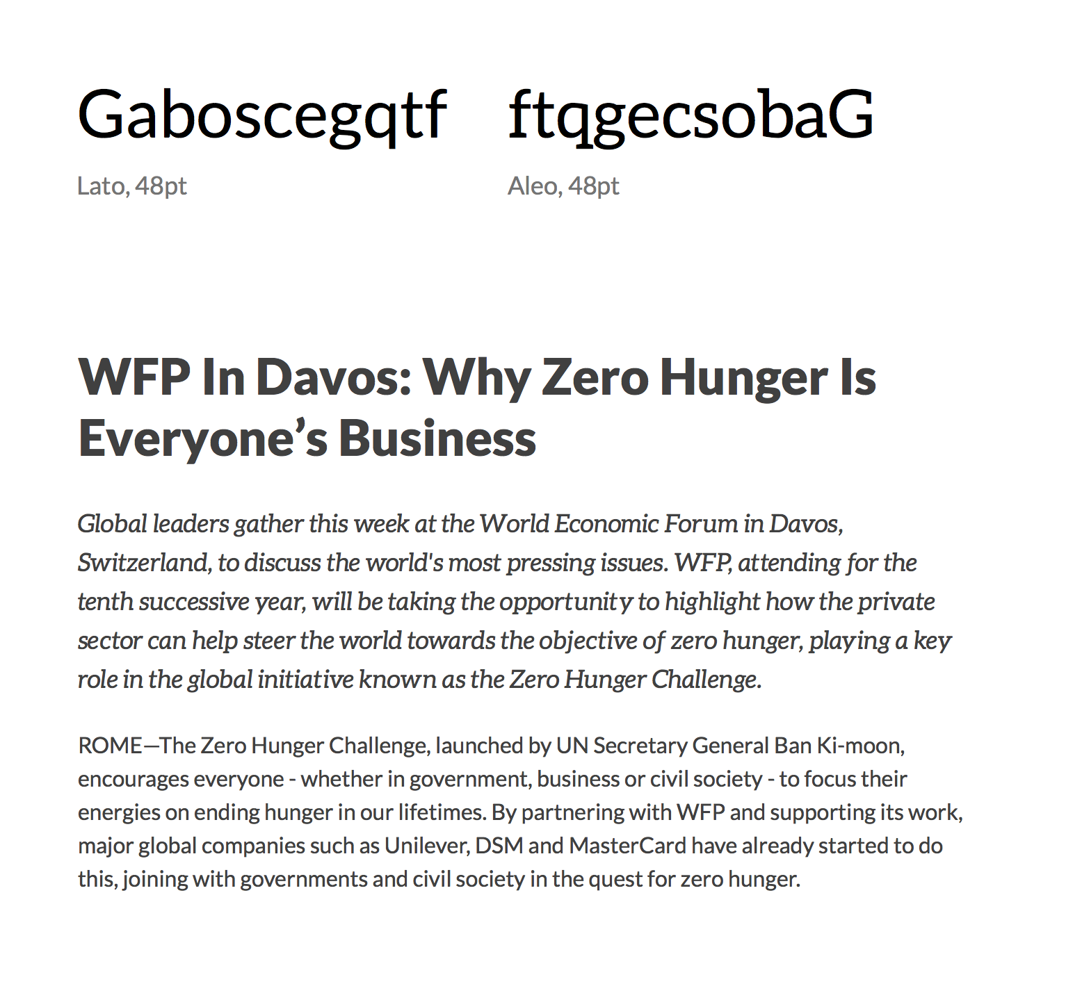
Lato is the primary typeface for user interfaces; it’s a round, humanist sans-serif, with incredibly warm appeal. It can be used for both headlines and paragraphs alike, as well as for interface elements.
-
Aa
Regular
-
Aa
Italic
-
Aa
Bold
-
Aa
Bold Italic
-
Aa
Black
-
Aa
Black Italic
Aleo was designed as a slab-serif counterpart to Lato. It looks great in both paragraphs and headlines, although it should be used sparingly where a slight emphasis is required, such as main article intros or pull-out quotes.
-
Aa
Regular
-
Aa
Italic
-
Aa
Bold
-
Aa
Bold Italic
Example

Sizing
The size of your text is as important for your message, as your WFP colours are to its branding. When the type is too small or too large, it becomes illegible, thus increasing the strain on the reader’s eyes, making reading uncomfortable.
To make your text legible and readable follow the guidelines below to setting your type:
-
Sans-serif
- Base font-size: 16px;
- Minimum font-size: 14px;
- Line-height: 1.5em;
-
Slab-serif
- Base font-size: 16px;
- Minimum font-size: 14px;
- Line-height: 1.5em;
Example Sizes
- 14px—an absolute minimum, used only for small interface elements, or small print (notices, image descriptions); not intended for main body text;
- 16px—the base font size, used for majority of things, from body text, to interface elements; it’s a minimum recommended size for body text;
- 14–32px—a range of sizes covering headings, from the smallest, to the largest; these should always be displayed in bold.
Dos and Don’ts
- Don’t try to mix two typefaces within a single section, such as a paragraph or a heading. If you need to differentiate a piece of text, use stressed emphasis or strong importance.
- Don’t try to mix different sizes of text within a single section or use editing tools to apply styling or colour to the text manually. Underlines are allowed only on links, but they belong to a different set of styles, separated from the above guidelines.
- Always keep the colour contrast in mind. Your copy should be readable and easy on the eye. Try to avoid plain white or black colours to style text and/or background. The basic body text colour is
#303132;#ffffffis used for the background. - Always keep your content plain and simple. Don’t add unnecessary formatting where it’s not required and leave styling of the content to your desiger. This will ensure all of it looks consistent.